Baro-Joowoo

Refining UX for GS Caltex's Oil Refueling App

Mobility users now expect more convenience, personalization, and sustainability in their refueling experience. Drawing on user insights, I identified key improvements for a fuel app, designed targeted updates for refueling needs, and refined the experience through thorough testing.

Type

Team Project (4 per) at Daylight Design, Seoul

Role

UI Designer

Date

July - September 2023

My Impact

Secondary research Insights Synthesis User Testing GUI Design UI Design

Dashboard Sidebar Close Up

Through user testing of the existing app, we established three key design goals to enhance the refueling experience: effortless, speedy, and effective. The “effortless” goal focuses on ensuring that the app doesn’t require users to perform actions that weren’t part of their original refueling routine, keeping interactions simple and familiar. The “speedy” goal addresses users’ psychological need to complete refueling quickly, minimizing any steps that could slow them down. Finally, “effective” aims to solve communication difficulties seamlessly throughout the process, enhancing the overall ease and satisfaction of the refueling experience.

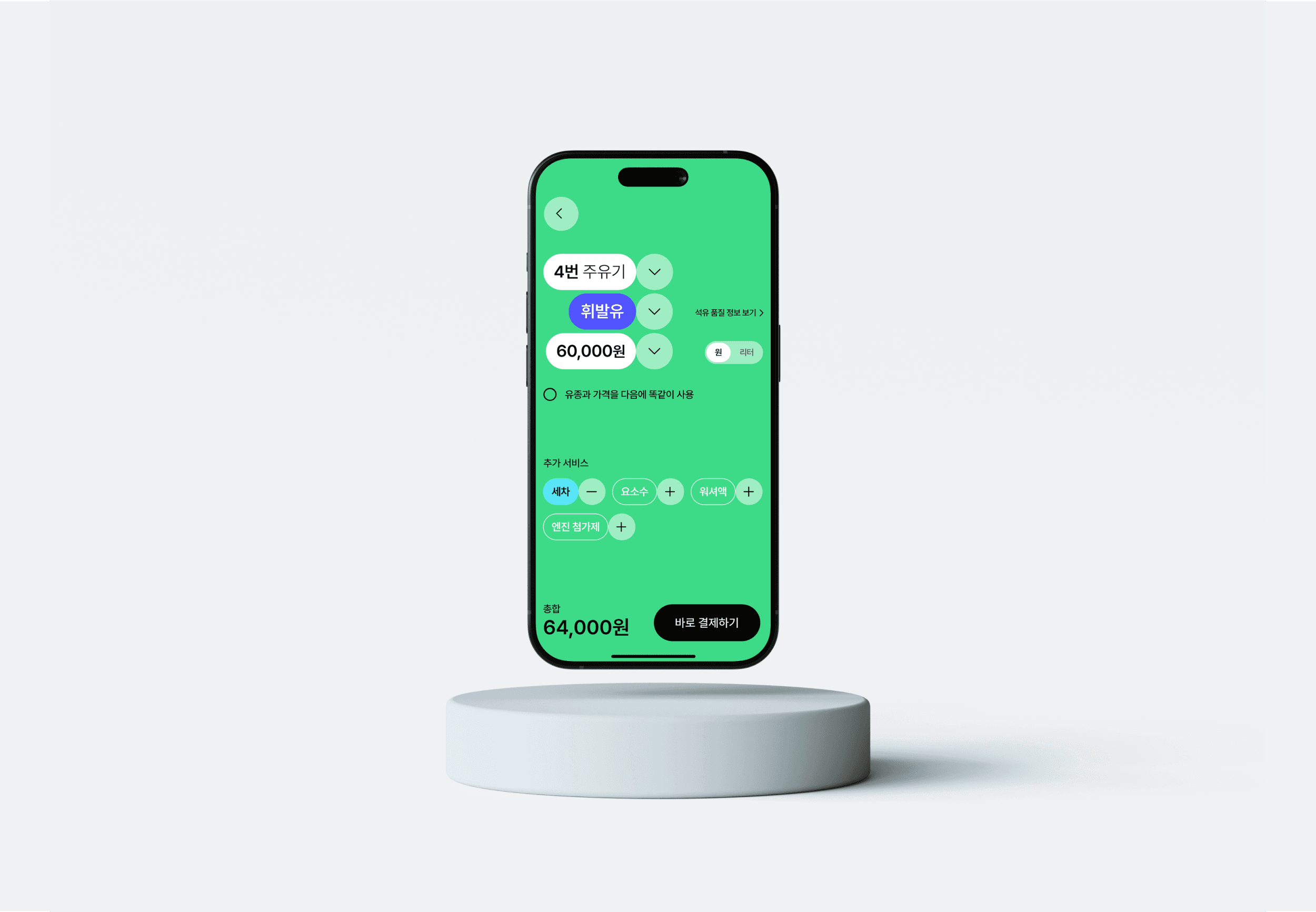
First, I noted that users enter the app through different pathways, so I designed screens that highlight distinct values based on each entry route. I also separated the main function, the "Quick Refuel" page, into a bottom sheet to give it prominence.

Next, I focused on the gas station exploration feature. Since each station offers different services, I organized useful information for users in a clear hierarchy, ensuring the design effectively communicates relevant details and enhances usability.

The next feature is the "Baro-Joowoo (Quick Refuel)" progress screen displayed during refueling. To address the potentially overwhelming environment upon entering a station, I developed an intuitive UI system with a minimalist visual design. This enables the users to navigate the process effortlessly and stay focused on essential actions.

After refueling, the user receives a fueling report, providing a clear summary of their recent transaction. The app supports continuity by offering relevant suggestions or options based on the user’s refueling history, making it easy to monitor fuel usage and optimize future visits.

What I'ved Learned

Keen insights that capture even the small user experience

Through this project, I gained a deep appreciation for the importance of listening closely to users to produce a high-quality UX outcome. I learned that even the smallest details, such as the size and placement of components, must be designed with the user’s experience in mind—not just the broader planning decisions. Assisting with user testing, I continually refined screens based on insights gathered, experiencing firsthand the process of building a thorough and user-centered product.

Haeeun Shin . 2025 Portfolio

Haeeun Shin . 2025 Portfolio

Haeeun Shin . 2025 Portfolio